Create Your First Project
Start adding your projects to your portfolio. Click on "Manage Projects" to get started
ALCHEMY OF THE SPIRIT
PROJECT TYPE
Branding, Packaging
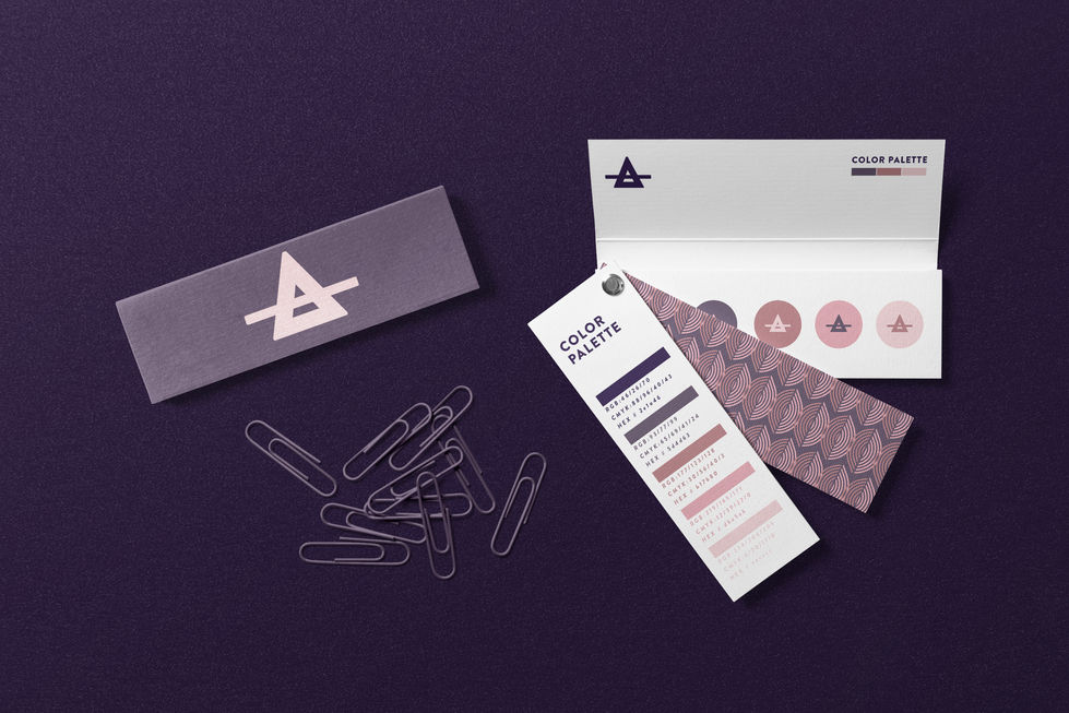
Alchemy of the Spirit is a distributor of low intervention wines and craft spirits. I was hired to create a full branding experience. The "A"in Alchemy was replaced with the alchemy symbol for air. It acts as a logo mark for the brand, as well as a supportive element for the typographic logo. The theory statement "As Above So Below" is the original inspiration shared by the client. It was then used for the design concepts of the wine label, enamel pins, etc. This design holds multiple representations such as: the four stars are the four main elements of alchemy (fire, water, air, earth). The rolling hills represent the origins of wine, which is the earth where the vineyards are cultivated. It's mirrored so you have the physical representation of the phrase "As Above So Below”. Nathan Brown assisted Hargis Studio with direction.


